Symbol meaning:
Logo:
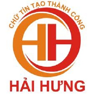
Inspired by professional lenses, this projector lensand the eye image incorporating yin-yang spiral create such smooth and continuous motions.
The solid lines combined with strong colors create a solid block affirming the brand personality and the industry’s characteristics in the logo.
The circle always creates the feeling of eternity and no stops. This is also the desire of business people who work towards success, conquest and do not want a stop.
The eye icon incorporating a lens speaks of the accurate and far, wide vision, the seizure of future and opportunities, which will bring the certainty and create trust in customers and suppliers.

Colours:
The specific hot coloursreflect the burning enthusiasm ahead of time and the desire to create novelty, add on dynamic, youthful and energetic nuance, and at the same time express the trust, sincerity and professionality.
Red: Intriguing, daring, adventurous and passionate
Orange: Classical, friendly, confident, warm and creative.
With the usage of striking and daringcolours, Hai Hung’s logo has reflected all the meaning and certainly has impressed the most fastidious customers by the reliability and prominence of Hai Hung brand.

